Avoid These Mistakes When Making a Wedding Website
Picture this: your wedding website is the digital front door to your big day. It’s where guests will get their first taste of your wedding vibe, the place they’ll find all the need-to-know details, and where they’ll RSVP, check out your gift registry, and maybe even sneak a peek at your engagement photos. It’s not just a website—it’s the nerve center of your wedding planning universe. But as with anything wedding-related, it’s easy to make a few missteps along the way. So, let’s talk about the biggest mistakes to avoid when making a wedding website, and how you can steer clear of them to create a site that’s as flawless as your first dance.
Not Including All the Important Details
One of the cardinal sins of wedding websites is leaving out the nitty-gritty details that your guests need to know. Sure, everyone loves a pretty photo of you and your soon-to-be spouse, but if you’re missing the basics—like the date, time, and location of the event—you might as well be inviting your guests to a game of hide-and-seek. Make sure you include all the essentials: when and where your wedding will take place, the dress code (black tie? beach casual?), and any special instructions.
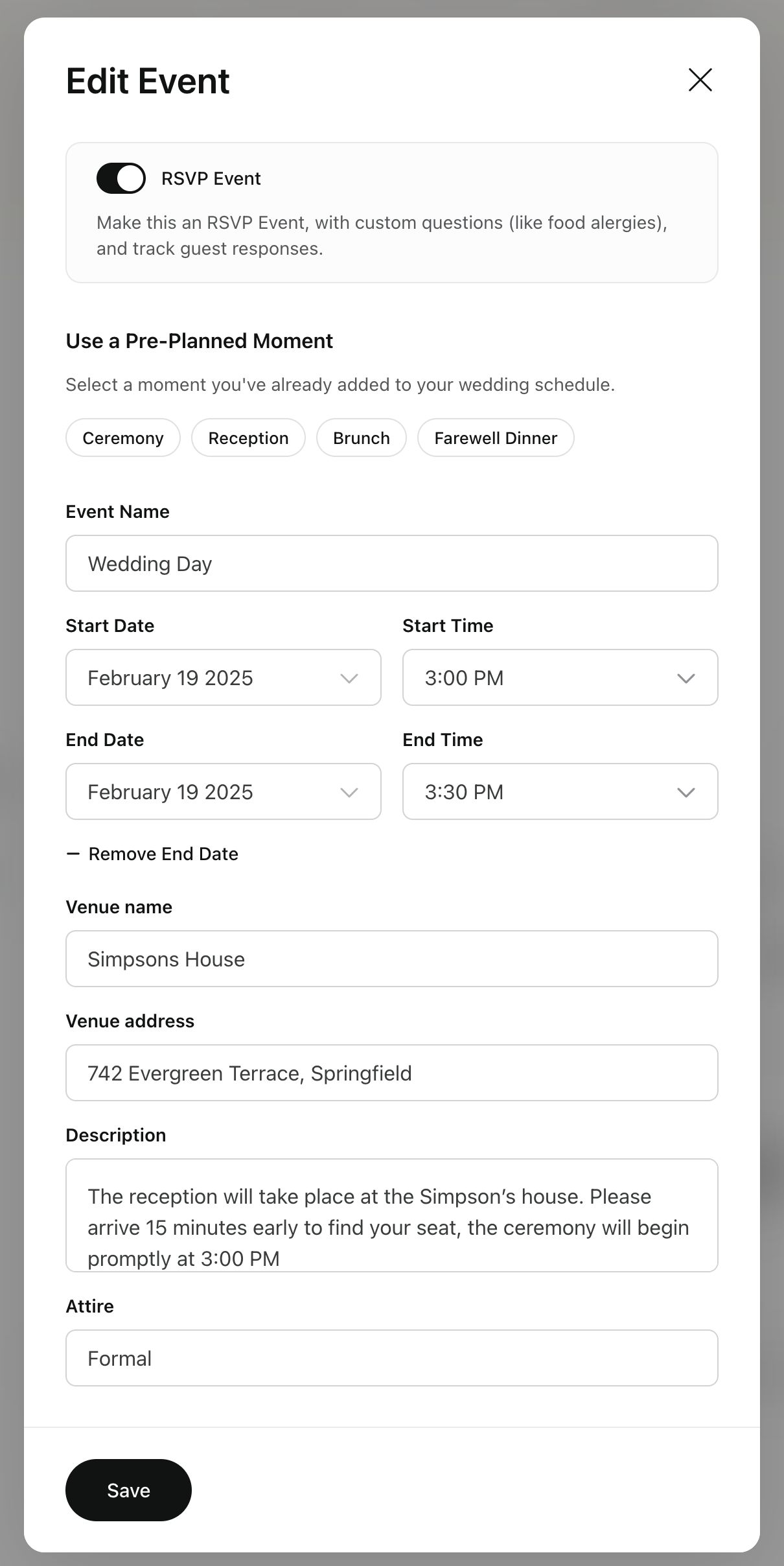
Don’t forget about those often-overlooked but oh-so-important extras, like parking info, accommodation suggestions for out-of-town guests, and whether your wedding will be kid-friendly or adults-only. Save your friends and family from having to text you last-minute questions by providing all the answers up front. A well-detailed wedding website is the gift that keeps on giving—keeping everyone informed and letting you focus on more important things, like perfecting your vows.
Incorrect or Outdated Information: The Ultimate No-No
There’s nothing worse than giving your guests the wrong information—or no information at all because you forgot to update your site. Imagine this: your ceremony is at the lush garden venue you booked six months ago, but your wedding website still says the ceremony’s at that downtown loft you changed your mind about. Oops! That’s a recipe for disaster, or at the very least, a lot of frantic phone calls.
Keep your wedding website up-to-date by double-checking all the details and setting reminders to review the information regularly. Think of it like editing your favorite blog post—it needs to be polished and accurate. If anything changes, whether it’s the start time, venue, or guest list, update your website right away. Your guests will thank you for the clarity, and you’ll avoid any wedding day confusion.
Skipping the Theme: Your Website Should Match Your Wedding Style
Your wedding website is an extension of your big day, so it should look and feel like it! Imagine showing up at a sleek black-tie wedding only to discover that the website was all sunshine, surfboards, and flip-flops. Jarring, right? That’s why your website’s design should reflect the vibe of your wedding. Are you going for a romantic garden affair with soft florals and fairy lights? Then your site should feature similar colors, fonts, and imagery to set the tone.
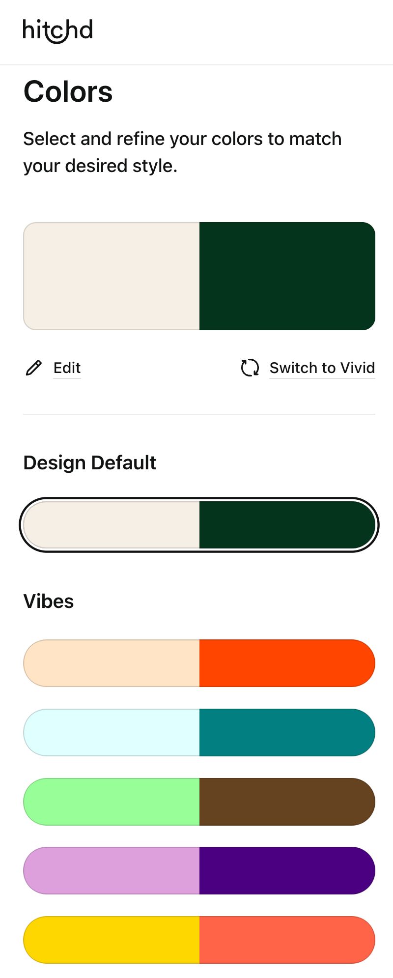
Start with templates that match your style, then customize them to make the site uniquely yours. Use your engagement photos, play with fonts that match your invites, and keep the color palette consistent with your wedding decor. This consistency not only creates a cohesive look but also gets guests excited and in the right mindset before they even arrive.
Forgetting the Registry: Where’s the Gift List?
So, you’ve picked out your dream espresso machine, that gorgeous set of wine glasses, and a honeymoon fund—but where is it? Hiding your registry link deep in your wedding website is like burying treasure with no map to find it. Guests are eager to gift you something meaningful, so make it easy for them. Dedicate a clear and accessible section for your registry where all the links to your preferred gift lists are in one convenient spot.

Whether you’re registered for a honeymoon fund, a traditional registry, or a mix of both, make sure your guests can find it without having to dig. And remember, this is not the time to be shy. Your friends and family want to celebrate you, and having your registry easily accessible is a win-win.
No RSVP Functionality: Don’t Make It Hard for Guests to Say Yes!
Gone are the days of mailed RSVP cards that end up lost in the shuffle of junk mail. Modern wedding websites allow guests to RSVP directly online, and trust me, it’s a game-changer. But if your site lacks this feature, you’re making things unnecessarily difficult for your guests—and for yourself.
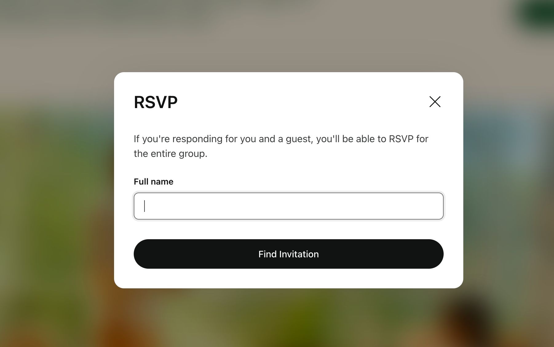
Include an RSVP section where guests can quickly confirm their attendance, choose their meal options, and note any dietary restrictions. Some platforms even combine this with guest list management, keeping everything in one place so you can track responses and follow up as needed. It’s efficient, eco-friendly, and saves you from having to decode anyone’s chicken scratch on a physical RSVP card.
Missing the Mobile-Friendly Mark: Design for All Devices
In today’s digital age, you can bet that most of your guests will be checking your wedding website from their phones. If your site isn’t mobile-friendly, that means a lot of pinching, zooming, and scrolling to find basic information. Not exactly the seamless experience you were hoping for, right?
Make sure you can preview your wedding website for mobile devices while you are creating it, it’ll save you lot’s of time and stress
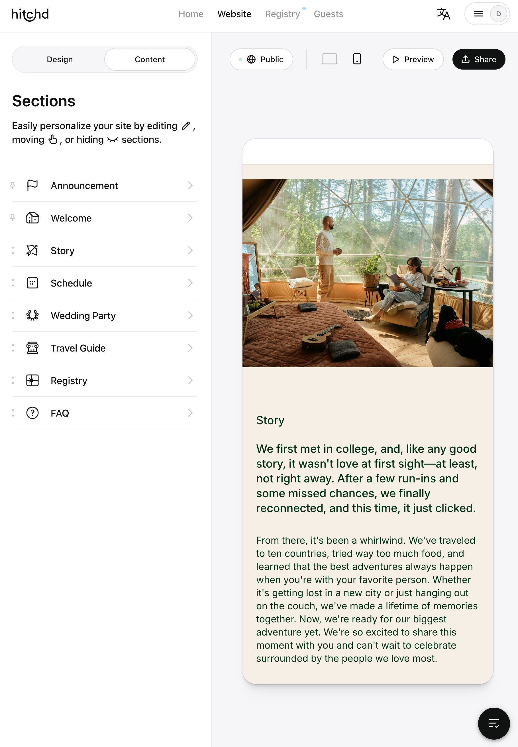
Make sure your wedding website looks great and functions well on all devices, from desktops to tablets to smartphones. Choose a website builder that offers responsive design templates that automatically adjust to different screen sizes. Test your site on multiple devices to ensure everything is legible, images load correctly, and all buttons and links are easy to tap. A little extra effort here goes a long way in keeping your guests happy and well-informed.
Choosing the Wrong Platform: Don’t Let Ads Ruin Your Wedding Website
It’s tempting to assume that a free wedding website might mean limited features or intrusive ads,. But that doesn’t have to be the case. Some free platforms may indeed come with restrictions, but Hitchd’s wedding website option breaks the mold by providing a polished, ad-free experience that doesn’t compromise on quality or functionality.
With Hitchd’s free wedding website builder, you can enjoy integrated features like guest list management, RSVP tracking, and seamless registry links. It’s designed to make planning smoother and to reflect the care and thought you’re putting into your big day—all without the usual free-site drawbacks. The best part? You can save on costs while still presenting a professional, elegant site that complements your overall wedding vision, all with 100% zero ads.
Forgetting to Personalize: Your Website Should Tell Your Story
Your wedding website isn’t just a place to post the who, what, when, and where—it’s also a chance to share your unique love story. Don’t miss out on personalizing your site with touches that reflect who you are as a couple. Add engagement photos, write a timeline of your relationship, or sprinkle in fun facts about your wedding party.
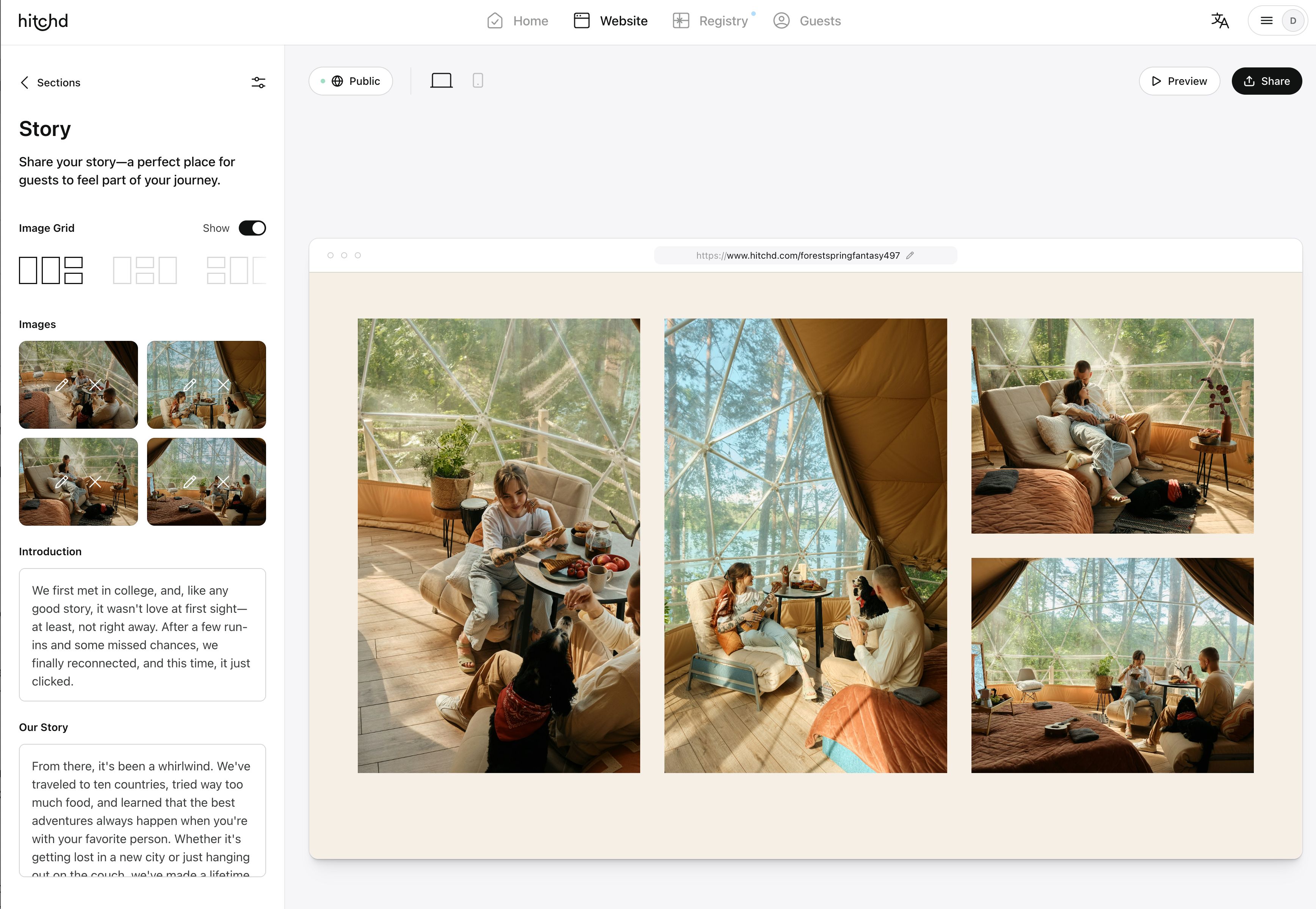
These personal touches make your website memorable and enjoyable for guests, setting the tone for your celebration. Think of it as the warm-up act to your wedding day, giving your friends and family a glimpse into the journey that brought you to this moment. After all, your wedding is all about celebrating your love—so let that love shine through on your website.
Forgetting to Include Fun Extras: Missed Opportunity to Delight Guests
Sure, your wedding website needs to be informative, but who says it can’t be fun too? Don’t miss out on adding interactive elements that can enhance the guest experience and build excitement for your big day. Consider including a quiz about you and your partner (“How well do you know the bride and groom?”), a gallery of engagement photos, or even a behind-the-scenes blog documenting your planning journey.
These extras not only make your site more engaging but also create an emotional connection with your guests, turning your website from just a functional tool into a delightful part of your wedding journey. It’s these little details that make your guests feel more connected and excited about celebrating with you.
Not Adding a Map or Directions: Don’t Leave Guests Lost
Nothing says “wedding day chaos” like guests who are lost en route to your venue. Don’t make the mistake of leaving out clear directions or a map on your wedding website. Include a Google Maps link or a detailed map with clear instructions on how to get to your ceremony and reception locations.
Also, think about including information on parking, nearby landmarks, or public transport options—anything that makes it easier for your guests to find their way. Especially if you’re having a destination wedding or an event in a less familiar location, clear directions can save a lot of stress and ensure everyone arrives on time, ready to celebrate.
.

Creating your wedding website is an exciting part of the planning process, but it’s easy to overlook important details in the hustle and bustle. By avoiding these common mistakes—like skipping essential information, not matching your wedding theme, forgetting to include a registry, and more—you can ensure your site is both beautiful and functional. Think of your wedding website as more than just a checklist item; it’s an opportunity to share your story, keep your guests informed, and build excitement for your big day. With the right approach and tools, you’ll create a wedding website that’s a perfect preview of the celebration to come.
FAQs
- How can I use my wedding website to manage multiple events (like a welcome party or farewell brunch)?
To manage multiple events on your wedding website, create dedicated sections or pages for each event with all relevant details, such as time, location, dress code, and RSVP options. This helps guests easily find information about each event and lets you track RSVPs separately. You can also use the website to share event-specific updates or changes, ensuring everyone stays in the loop.
2. Can I integrate travel information and tips on my wedding website for out-of-town guests?
Yes, you can enhance your guests’ experience by including a dedicated travel section on your wedding website. Add tips on local accommodations, recommended airports, transportation options, and even sightseeing suggestions for guests who might want to explore the area. Providing links to hotels with room blocks or offering exclusive discount codes can also be incredibly helpful.
3. How do I ensure that my wedding website content is accessible for older guests or those less familiar with technology?
To make your wedding website more accessible for older guests or those less tech-savvy, keep the layout simple and straightforward with clear navigation. Use large, readable fonts and avoid overly complex or cluttered designs. Include clear instructions for RSVPs and provide alternative options like phone or email for those who might struggle with online forms. You could also consider having a tech-savvy friend or family member on standby to assist these guests.
4. How can I make my wedding website environmentally friendly?
To create an eco-friendly wedding website, opt for digital communications wherever possible—like RSVPs, save-the-dates, and updates—reducing the need for printed materials. Encourage guests to access information online rather than printing it out. You can also include eco-friendly tips for your guests, such as using sustainable travel options or reducing plastic use during their stay, aligning your wedding’s digital presence with your environmental values.
5. Can I use my wedding website to connect guests who don’t know each other?
Yes, you can foster connections between guests by creating a section on your wedding website that introduces key people, such as the wedding party or family members. Include fun facts, stories, or even short bios to give guests a sense of familiarity before they meet in person. This not only makes your website more engaging but also helps guests feel more connected and comfortable on the big day.

Free Wedding Website, RSVP, Guest List, and Award-Winning Registry
Create your free world-class wedding website in minutes. Experience the award-winning registry, RSVP, Guest List and more. Get Started — It's Free


