How to Make a Wedding Website — An Intro
Your wedding website can be so much more than a basic online invitation —it’s the first glimpse your guests get into the magical world of your big day. It’s not just an afterthought, it’s a key player in your wedding ensemble. Your website is your central hub, the one place where all your wedding details come together in perfect harmony. But here’s the thing: designing it doesn’t have to be daunting or dull. With a little creativity, some basic design know-how, and a sprinkle of inspiration from all the senses, you can create a wedding website that’s not only informative but also uniquely you. Let’s dive in!
Start with Inspiration: Your Wedding Website as a Reflection of Your Love Story
When it comes to creating a wedding website, inspiration can come from anywhere. Sure, you’ve got the usual suspects—your color palette, your venue, your favorite Pinterest board—but why stop there? Think about the first song you danced to in the kitchen, the scent of your favorite candle, or the taste of your go-to dessert. The beauty of designing a wedding website is that it can reflect all these little pieces of your story.
Start with an inspiration exercise: grab a glass of wine, put on your favorite playlist, and jot down a few things that make your relationship special. Is it the way you both geek out over 80s music? The cozy feeling of Sunday mornings in bed with coffee? Use these personal touches as your starting point. Create a mood board or a playlist that embodies your relationship—this can help guide your color choices, imagery, and even the tone of your text. Your wedding website should feel like a virtual extension of your love story, with all the little quirks and details that make it uniquely yours.
Go beyond just visual themes and think about how your wedding makes you feel. Are you aiming for a lighthearted, whimsical celebration? Maybe you’re going for something sleek and modern. Your website can—and should—mirror that energy. If your wedding is inspired by a specific season or even a favorite film, let that influence seep into your website design. Imagine a winter wedding with cozy, warm colors and textures or a vintage-inspired wedding with retro fonts and film grain imagery. And don’t forget to include your guests in this vision—whether through a sneak peek at your wedding playlist or a fun countdown to the big day.
Color Theory 101: Choosing the Perfect Palette for Your Wedding Website
Choosing a color palette for your wedding website is like picking out your bridal bouquet—it should complement your overall look and evoke the right mood. Color theory isn’t just for art majors; it’s a handy tool for anyone looking to set the tone for their site. Colors can evoke emotions: blues for calm and trust, greens for freshness and growth, and reds for passion and excitement. Your palette can tie in with your wedding’s overall theme, whether it’s a whimsical garden party or a sleek city celebration.
If your wedding flowers are blush peonies and eucalyptus, why not incorporate those soft pinks and greens into your website? Or if you’re planning a destination wedding on the beach, think about the hues of the ocean and sunset. But remember, readability is key—so ensure your text stands out against your background colors. You don’t want your grandmother squinting at the screen trying to decipher your RSVP deadline because your font is blending into the background. Experiment with shades and contrasts, and don’t be afraid to mix and match until it feels just right.
A good trick is to start with three core colors: a dominant color that represents your theme, a secondary color to complement it, and a neutral to balance everything out. These three can then be expanded into various shades and tints to add depth and variety to your website design. Tools like Adobe Color or Canva’s color palette generator can help you visualize how your chosen colors work together. Also, consider the accessibility of your palette—high contrast is crucial for readability, especially for older guests or those with visual impairments.
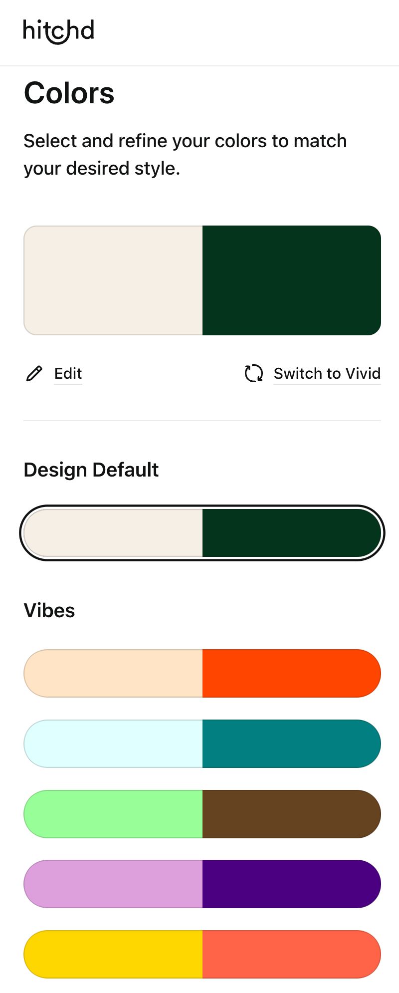
Don’t shy away from adding metallics or pops of unexpected colors, too. A touch of gold can bring in some glam, or a splash of coral can make everything feel more vibrant. Remember, your website is an opportunity to express your style, so let your creativity run wild. As long as it feels cohesive and true to your wedding’s overall look, you can’t go wrong. Just make sure that you are working with a wedding website builder that is customizable. Hitchd gives you the flexibility to let your creativity run wild while keeping your website cohesive and aligned with your overall wedding style. With a builder this customizable, the possibilities are endless!
Font Matters: Setting the Tone with Typography
Fonts are like the shoes of your wedding website—often overlooked, but they can make or break the whole outfit. The right font can instantly convey the mood of your wedding. Are you going for elegant and timeless? Opt for a classic serif. Want something modern and chic? A sleek sans-serif might be your style. Feeling whimsical? A fun script could add that playful touch.
Pairing fonts is an art form in itself. A bold script for your headings and a simple, clean font for the body text can create a beautiful balance. The key is to keep it consistent—too many font styles can make your site look messy and disjointed. And above all, prioritize readability. No one wants to decode a fancy cursive when they’re just trying to find out what time the rehearsal dinner starts. Did you find a font you love, but not included in your website builder? Make sure to work with a website builder, like Hitchd, that allows you to upload any of your favorite fonts.
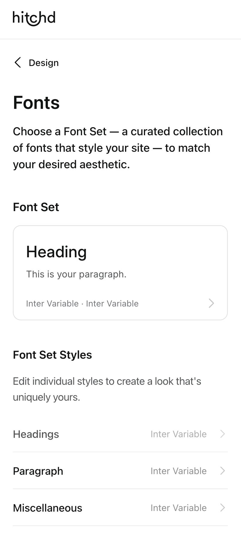
When choosing fonts, think about how they match your wedding’s vibe. A formal black-tie affair might call for a classic, elegant font, while a bohemian beach wedding could embrace something more laid-back and free-flowing. Tools like Google Fonts offer hundreds of free options, making it easy to experiment until you find the perfect match. Aim for two to three complementary fonts—a primary for headings, a secondary for body text, and an optional third for accents or highlights.
Size matters, too. Make sure your headings stand out and your body text is easy to read, both on desktop and mobile devices. Your font choices should guide your guests effortlessly through your site, from the save the date to the RSVP. And don’t forget about spacing—generous line height and letter spacing can make even the fanciest script easier on the eyes. The goal is to make your website not just beautiful, but also functional and accessible.
One of the tricks when selecting fonts is to work with a wedding website builder that automatically provides font pairings that have already been selected by professional designers. Even if you decide to go with something completely different, or upload your own fonts, this can provide a helpful starting point.

Personalize Your Content: Make It Sound Like You
Let’s face it, the best part of any wedding website is the personal touch. Guests want to hear your voice, not some generic template spiel. So, when it comes to writing your website content, make it sound like you. Are you known for your humor? Throw in a few jokes. Are you a hopeless romantic? Lean into that. This is your chance to tell your love story in your own words, whether it’s the mushy details of how you met or the hilarious mishap that happened when you first moved in together.
Start by drafting your content as if you’re talking to a friend. Write your welcome message, your love story, and your wedding party introductions in a way that feels natural and engaging. Don’t be afraid to let your personality shine through—it’s these little touches that will make your website memorable and uniquely yours. Remember, your wedding website is more than just a list of dates and times; it’s an invitation for your guests to get to know you as a couple.
Editing stock content is an opportunity to inject humor, sentimentality, or whatever feels right for your relationship. Introduce your wedding party with fun facts or anecdotes, like how your maid of honor is also your karaoke rival or how your best man once got you out of a particularly sticky situation. The goal is to make your guests smile and feel connected to your journey, not just informed about logistics.
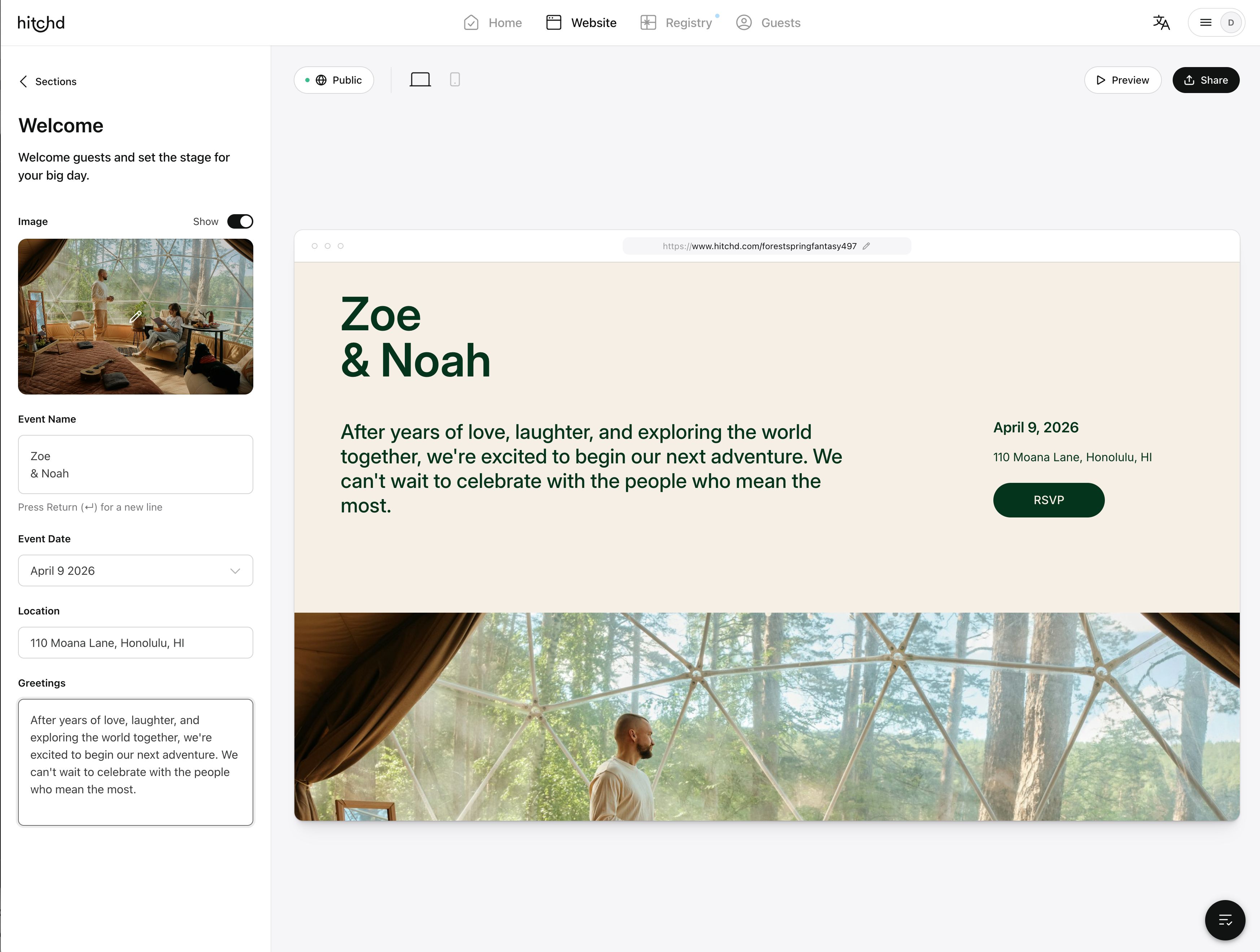
Remember to include all the important details, but do it in a way that feels conversational. If your wedding has a specific dress code, explain it in a way that’s easy to understand but also reflective of your style—“Think garden party chic with comfy shoes for dancing” sets the tone much better than just “Formal.” Use your own words, and don’t be afraid to break the mold. Your guests are there for you, and they’ll appreciate the extra effort to make your website feel like a warm, welcoming extension of your celebration.Having trouble using your own words? Select a wedding website builder that helps guide you in finding text that suits your style.
Practical Magic: Essential Features to Include
Now that you’ve got the aesthetics down, it’s time to get practical. Your wedding website should be a one-stop shop for all the important details your guests need to know. That means including the essentials like your wedding date, venue location, dress code, and RSVP deadline. But it’s also the perfect place to provide additional information that might not fit on your physical invitations, like accommodation options, or travel directions. Clear navigation is crucial—make sure your guests can easily find what they’re looking for without getting lost in a maze of menus. Include links to your gift registries, details about your wedding party, and any other events, like the rehearsal dinner or day-after brunch. The goal is to make your guests’ experience as smooth and enjoyable as possible, so they spend less time searching for details and more time getting excited for your big day.
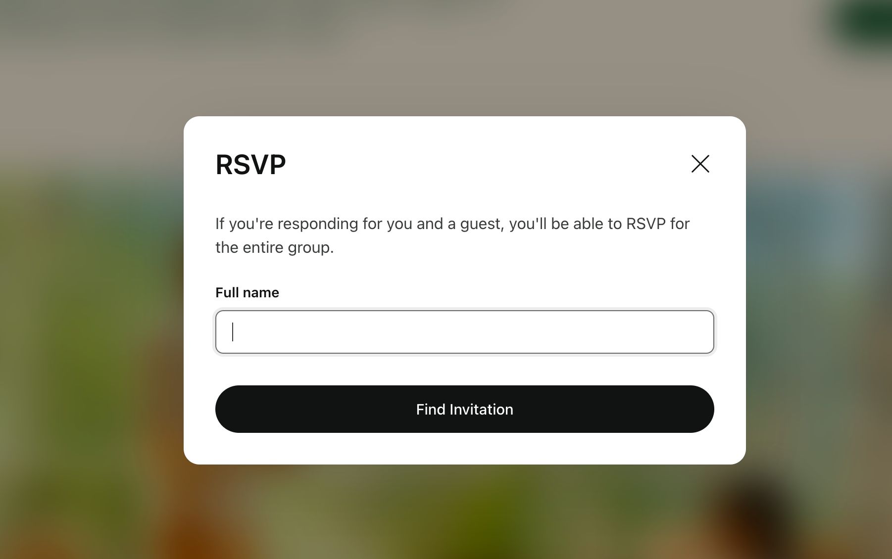
A comprehensive wedding website also acts as a backup plan for any last-minute changes. Need to adjust the start time of the ceremony? Moving the event indoors because of rain? Your website is the quickest way to communicate updates to all your guests without the headache of individual calls or messages. With Hitchd, there’s even an option to add an “Announcement” for those last minute changes. Having a FAQ section can also save you from repeatedly answering common questions like “What’s the dress code?” or “Can I bring my kids?”
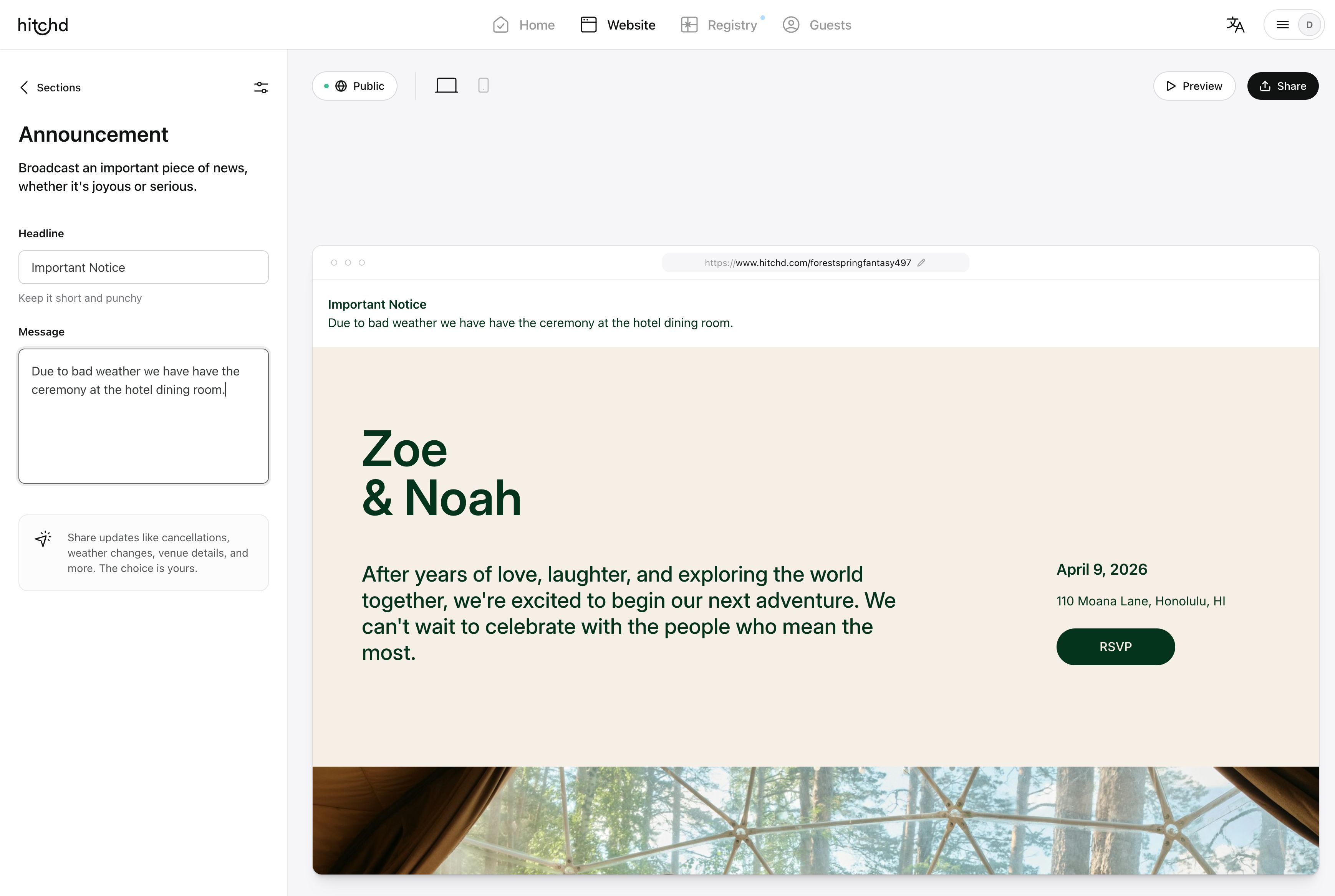
Consider setting up password protection for sensitive details, especially if you have private events or want to keep your wedding day under wraps from uninvited eyes. And remember, a good wedding website builder will offer templates that include these elements, ready to be customized to your needs. Make sure to test your site across different devices to ensure it looks great and functions well on both desktop and mobile, so all your guests have a seamless experience.
Your Website as a Central Hub: Linking Everything Together
Think of your wedding website as the central nervous system of your wedding communication. It’s where everything comes together: save the dates, invitations, RSVPs, registries, travel info—you name it. By linking everything in one place, you make it easy for your guests to find exactly what they need, whether it’s directions to the venue or your preferred gift registry.
Encourage your guests to bookmark your site so they can check back for updates. Planning a destination wedding? Include local tips and fun things to do in the area. Hosting multiple events? Provide a full schedule so guests know where to be and when. Your wedding website is not just about aesthetics; it’s about functionality and making life easier for everyone involved.
Incorporate directions for easy navigation, links to local attractions, and even transportation options for out-of-town guests. If you’re offering group rates or reserved accommodations, provide direct links so guests can book seamlessly. And don’t forget about your wedding party—they’ll appreciate having all the important dates and duties outlined in one place, from fittings to rehearsal schedules.

Your website also becomes a repository for memories. Post photos from your engagement shoot, or share updates on the planning process. It’s all about making your guests feel involved and informed, and turning your wedding website into an interactive part of your celebration rather than just an informational tool. Remember, the more organized and accessible your site, the smoother the lead-up to your wedding will be for everyone involved.
Don’t Forget About the Photos: Visual Storytelling
A picture is worth a thousand words, and on your wedding website, it’s worth even more. Use your engagement photos, snapshots from your adventures, and maybe even a few candid outtakes to tell your story. The goal is to give your guests a glimpse into your world—who you are as a couple and the journey you’ve been on together.
Create a gallery that complements the look and feel of your site, whether it’s a chic black-and-white collection or a vibrant splash of color. Keep it cohesive, but don’t be afraid to show off your playful side. After all, these photos are a sneak peek into the magic that your wedding day will bring.
Curate your gallery with intention—don’t just throw up every picture you’ve ever taken together. Choose images that represent key moments in your relationship, like the day you got engaged, trips you’ve taken, or simply sweet everyday moments that capture your bond. Add captions or stories to accompany your photos to provide context and add an extra layer of personal connection.
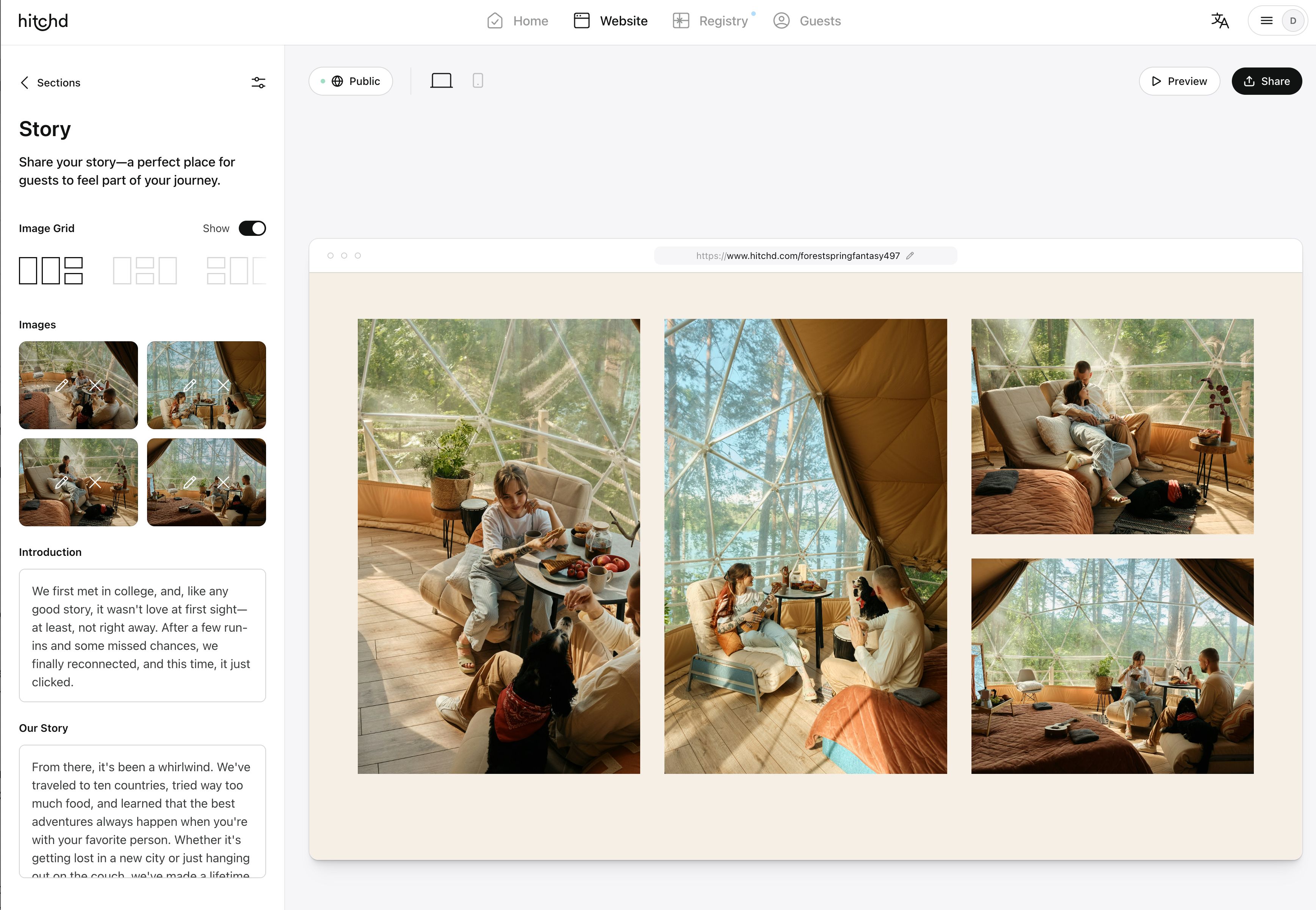
If you’re using professional engagement photos, make sure they’re high-quality and edited to fit the aesthetic of your website. But don’t shy away from including some of those real, unpolished moments too—those candid shots where you’re laughing or caught in a sweet embrace. It’s these authentic glimpses that will make your guests feel closer to you and excited to celebrate your next big chapter together.
Creating a wedding website that’s as unique as your love story doesn’t have to be a daunting task. Start with inspiration that goes beyond the visual—think about music, scents, and even your favorite tastes. Play with color and font choices that reflect your personality, and don’t be afraid to add personal touches through your content. Your wedding website is more than just a tool; it’s an extension of your celebration, a digital canvas where your love story can truly shine. So take your time, have fun with it, and remember: the best wedding website is one that feels authentically you.
FAQs
1. How can I make sure my wedding website reflects our unique personality?
Your wedding website should be as unique as your love story! Start by choosing a theme that matches your wedding vibe—think colors, fonts, and images that tell your story. Customize the text to sound like you; whether it’s playful, romantic, or a mix of both, let your personality shine through. Don’t hesitate to add unconventional elements like a playlist or personal anecdotes that make guests feel connected to your journey.
2. What if I’m not tech-savvy? Can I still create a beautiful wedding website?
Absolutely! We suggest finding a wedding website builder that is designed with user-friendliness in mind, offering drag-and-drop customization, pre-designed templates, and intuitive interfaces. Look for a platform that provides easy editing options and customer support to help you through any hiccups. Remember, it’s more about the thought and personal touch you put into it than about being a tech wizard!
3. How do I choose the right color palette for my wedding website?
Choosing the right color palette starts with your wedding’s overall aesthetic. Think about the mood you want to convey—soft pastels for a romantic garden wedding, bold jewel tones for a glamorous evening affair, or earthy neutrals for a rustic celebration. Use color theory as your guide: cool tones for calmness, warm tones for energy. Test combinations to find what feels most ‘you,’ and make sure to include enough contrast for readability.
4. How early should I create my wedding website in the planning process?
Ideally, your wedding website should be created as early as possible, once your date and venue are set. It serves as the go-to hub for all your wedding details, so having it ready from the start can help streamline communication with guests. Use it to share save the date information, engagement photos, and updates along the way. Remember, your wedding website is an evolving project that you can update as more details are finalized.
5. How can I include my cultural or family traditions in my wedding website?
Incorporating cultural or family traditions into your wedding website is a beautiful way to honor your heritage and share meaningful aspects of your celebration with your guests. Consider adding a section that explains any cultural rituals or traditions that will be part of your wedding day, along with their significance. Include photos or videos if available, and use this space to educate and engage your guests about what to expect. Personal stories, family anecdotes, or even a bit of history can make this section feel heartfelt and inclusive, giving your guests a deeper understanding of the customs that are important to you.

Free Wedding Website, RSVP, Guest List, and Award-Winning Registry
Create your free world-class wedding website in minutes. Experience the award-winning registry, RSVP, Guest List and more. Get Started — It's Free


