
Planning a wedding is hard enough without stressing over how your wedding website looks. But let’s be real—first impressions matter. Your guests might not say it out loud, but they’ll definitely notice if your wedding website looks like it was thrown together in five minutes. So, how do you make a free website look chic and expensive? Spoiler alert: You don’t need a designer or a hefty budget—you just need some clever design tricks and thoughtful planning.
Here’s how to create a wedding website that’ll make your guests think you went all out.
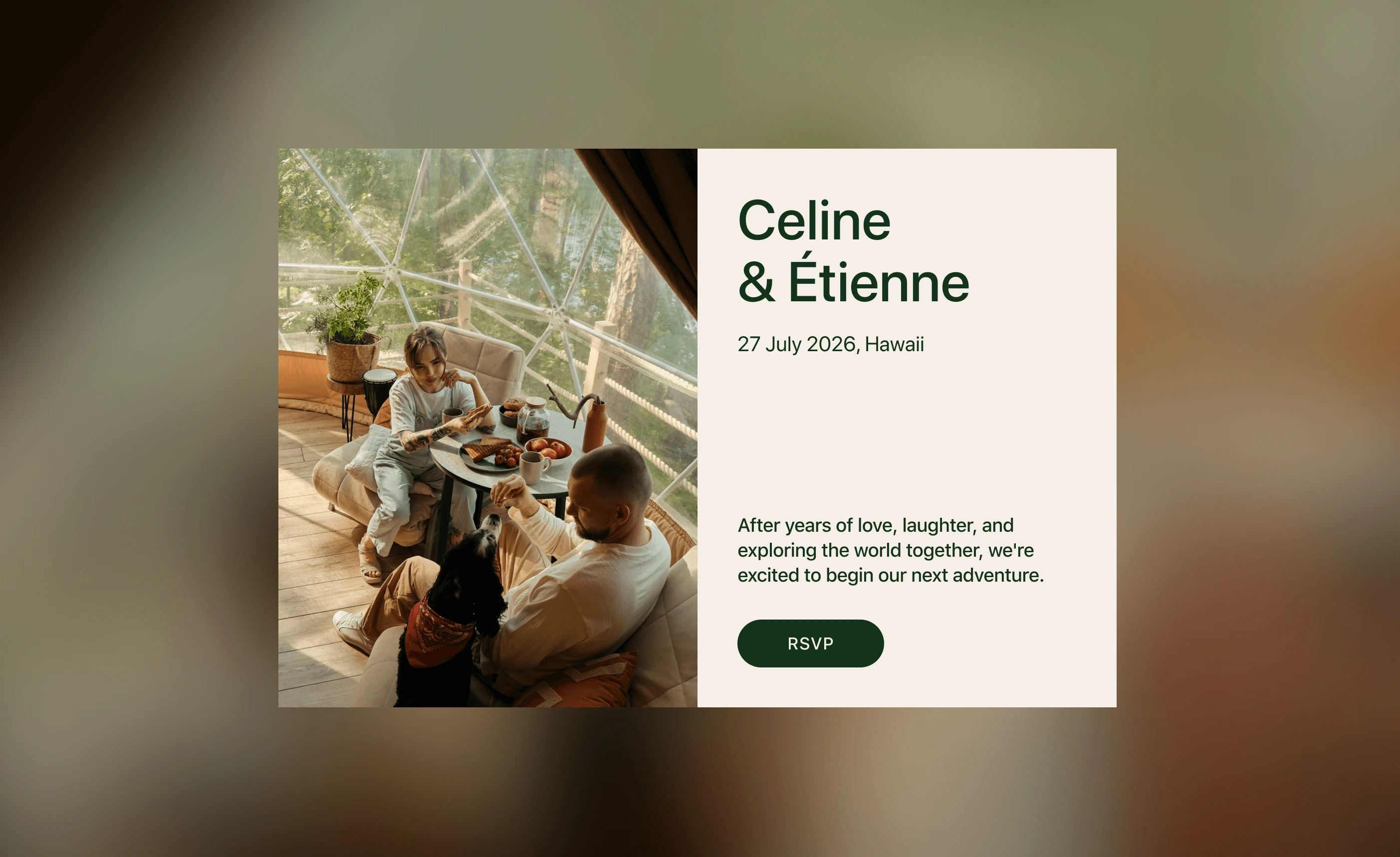
1. Choosing a Template That Feels Like You
Think of your wedding website like a digital extension of your save the dates and invitations. You want it to feel cohesive, polished, and reflective of your overall wedding vibe. The easiest way to nail that look? Start with a clean, elegant template.
Some free wedding website platforms offer a variety of templates, but not all templates are created equal. Go for something minimalistic with plenty of white space, clean lines, and a sleek layout. Avoid overly busy designs with clashing patterns or multiple font styles—it’ll look more cluttered than cool.
Pro Tip: Stick to a neutral color palette that matches your wedding theme. Think soft pastels, earthy tones, or classic black and white. This keeps things looking cohesive and upscale.
2. Curate a Cohesive Color Palette
A well-thought-out color palette can instantly elevate the look of your wedding website, giving it a polished, upscale vibe without any added cost. Think of your color palette as the visual glue that holds everything together—from your wedding invitation and save the date to your wedding day decor. By keeping your colors consistent across all platforms, you’ll create a cohesive, branded experience that leaves your guests impressed and excited for the big day.
Why Color Consistency Matters
Imagine visiting a wedding website where every section has a different color scheme—it would look chaotic, right? On the flip side, when the colors flow seamlessly, everything feels more intentional and sophisticated. A unified color palette gives your site a professional finish and makes your guests think you’ve spent big bucks on a designer (even if you didn’t!).
How to Choose the Right Colors
Here’s a simple strategy for selecting an on-point, cohesive color palette that works across your free wedding website, printed materials, and decor:
- Pick 2-3 Main Colors
Start by choosing two or three core colors that reflect your wedding theme. Are you going for a romantic vibe? Soft pastels like blush and sage green work beautifully. Want something modern? Navy blue paired with gold accents creates a sleek, elegant feel. - Use Complementary Shades for Accents
Once you’ve selected your primary colors, find complementary shades to use for accents. These can be used on buttons, section dividers, or call-to-action elements like the RSVP button. Tools like Canva’s color palette generator or Colors can help you find the perfect matching tones. - Ensure Readability with High Contrast
No matter how stunning your color scheme is, it’s useless if your guests can’t read the content. Always ensure there’s enough contrast between your text and background. For example, avoid using light gray text on a white background—it might look trendy but will leave your guests squinting.
Final Touches
Beyond just picking colors, think about how they’re applied throughout the website. Use your primary colors for headers, section backgrounds, and large design elements, while saving accent colors for smaller details. This balance ensures your site feels coordinated and elegant, without overwhelming the viewer. To make things easier, with Hitchd, you can choose from an extensive list of colour pairs that have been curated to work together.
In short, curating a cohesive color palette isn’t just about aesthetics—it’s about creating a unified, memorable experience that ties your entire wedding planning journey together. Stick to these tips, and your free website will look anything but cheap!
3. High-Quality Images Are Everything
When it comes to making your free wedding website look like a million bucks, high-quality images are non-negotiable. Your website is likely the first glimpse your guests will get into your wedding, so it needs to set the right tone. Using sharp, professionally shot photos—whether it’s your engagement photos, venue images, or even well-curated stock pictures—can transform your site from something ordinary to something truly breathtaking.
Why High-Quality Images Matter
Imagine landing on a website with pixelated, blurry pictures—it screams rushed and unpolished. On the other hand, clear, vibrant images immediately give your site a refined, high-end feel. Great photos don’t just make your site visually appealing; they also help tell your story. Whether it’s a shot of the venue where you’ll say “I do” or a candid moment from your engagement shoot, these images provide context and excitement for your big day.
Hitchd makes it easy to showcase these moments with its story section, which features over 15 image grid layouts. These layouts help you display your photos in a tasteful way that works seamlessly with the website template, so you don’t have to overthink the design. It’s the perfect way to bring your story to life while keeping everything polished and cohesive.
What to Include
To ensure your website looks cohesive and professional, include a mix of personal and scenic images. Here’s what works best:
- A Homepage Hero Image
Think of this as your website’s first impression. Choose a bold, stunning image—ideally a couple photo or a dreamy engagement shot—that sets the tone for the entire site. If possible, use a wide-angle shot with plenty of background space so that any overlaid text remains easy to read. - Image Grids Guests love visuals, so why not give them a peek into your journey? Create sections dedicated to your wedding details, showcasing images of your venue, wedding party, and even décor inspiration. With Hitchd, you have 15 different grids to choose from—get creative and include a mini gallery of past family events or special moments to make things more personal.
- Custom Section Backgrounds
Some free wedding websites allow you to add custom background images to individual sections. Done right, this can elevate the overall aesthetic. The trick is to keep it subtle—think scenic shots, soft texture patterns, or even a close-up of your wedding flowers. Avoid busy or overly colorful images that might distract from the content.
Pro Tips for Image Use
- Resolution is key: Stick to high-resolution images to avoid pixelation, especially for full-width or large background photos.
- Stay consistent: Use a consistent editing style or filter across all photos for a cohesive look.
- Keep it light: While images are important, don’t overload your site with too many. A clean, streamlined look always feels more luxurious.
By carefully curating high-quality images, you’ll create a wedding website that looks polished, professional, and personal—exactly what you want to wow your guests and get them excited for your wedding day. With the Hitchd wedding website builder, showcasing these images is effortless. Its intuitive design tools and customizable layouts ensure your photos shine, helping you create a site that feels uniquely yours while making a lasting impression on your guests.
4. Typography: Your Secret Weapon
Typography might seem like a small detail, but it’s a game-changer when it comes to giving your site a timeless and elegant look. Choose elegant, timeless fonts that are easy to read. Skip anything too whimsical or quirky—it’ll cheapen the look. Pro Tip: Use one primary font for headers and a complementary font for body text. Make sure your font sizes are legible across devices. Tiny text might look artsy, but if Grandma can’t read it, it’s a problem. Keep line spacing consistent for a clean, polished appearance. Hitchd makes typography effortless with its extensive list of high-quality fonts you can choose from, along with predefined font sets that have been tested and guaranteed to look perfect. Plus, if you’re going for a specific theme or want consistency with your wedding brand (like matching your invites), Hitchd allows you to upload your own custom fonts. This way, your site looks polished, professional, and perfectly aligned with your wedding vision.
5. Add Personal Touches That Wow
Want your website to feel luxe and personal? Add elements that reflect your unique story as a couple. This goes beyond just listing the wedding date and venue. Think of it as a digital scrapbook that introduces your love story to your guests.
Here’s what to include:
- A love story section: Share how you met, your proposal story, or even funny anecdotes about your relationship.
- Wedding party bios: Introduce your wedding party with photos and short descriptions.
- Guest list and RSVP: Make it easy for guests to respond by adding a clear and simple event RSVP form.
- Password protection: For added privacy, consider using platforms that offer password-protected sites. It adds an air of exclusivity.
##6. Integrate Your Website with Key Features
An effortlesswedding website isn’t just about looking good—it’s also about functionality. To truly impress your guests and make their experience seamless, integrate your site with essential features like RSVP tracking and your registry.
Why Integration Matters
Your wedding website is the central hub for all things wedding-related. By linking RSVP tools and your registry directly to the site, you save guests the hassle of navigating multiple platforms. It’s also a great way to keep everything organized and in one place, making it easier for both you and your loved ones.
Features to Include
- RSVP Tracking: Many free wedding website platforms offer built-in RSVP tools that allow guests to [confirm their attendance])https://www.hitchd.com/blog/who-to-invite-to-your-wedding) in just a few clicks. You can even include meal preferences and song requests to make things interactive and fun.
- Registry Integration: Add links to your registry or embed it directly into your site. Some platforms even let you sync multiple registries, so guests have everything at their fingertips.
- Event Details: Include schedules, directions, and any other essential information to keep guests informed without sending separate emails or invites.
By integrating these features, you’re not only adding convenience but also elevating your website to feel polished and professional. It’s these thoughtful details that make all the difference in creating a memorable experience for your guests.
FAQs
How do I choose the best color palette for my wedding website?
Start by selecting 2-3 primary colors that match your wedding theme. Use complementary shades for accents and make sure there’s enough contrast for readability. Soft pastels, neutrals, or classic black and white often give a polished look.
Should I use engagement photos on my wedding website?
Absolutely! High-quality engagement photos add a personal and elegant touch to your website. Use them as a hero image on your homepage or in a dedicated gallery section to create visual interest and keep guests engaged.
How can I make my free wedding website look expensive?
Focus on design elements like typography, color palette, and high-quality images. Choose a sleek template, add personal touches like your love story and guest list, and keep the layout clean and cohesive.
Free Wedding Website, RSVP, Guest List, and Award-Winning Registry
Create your free world-class wedding website in minutes. Experience the award-winning registry, RSVP, Guest List and more. Get Started — It's Free